Showing posts with label advertisement. Show all posts

Wednesday, 7 July 2010

Get dressed in the NME, 1981-5

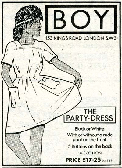
Boy advertisement, NME, 19th December 1981, page 83. 

Here's the last of the clothing ads from the small pile of NMEs remaining in my possession, and these date from 1981 to 1985.  You might notice that most of them come from the bumper Christmas issues, which were the ones I was most likely to keep for their end-of-year summaries, not to mention the hugely enjoyable collections of fatuous quotes from pop stars cherry-picked from the year's interviews.

So Boy's advertisement (above) for a party dress is rather confusing.  It looks like a summer dress to me, especially accessorised with the headband/sweatband.  Mind you, "rude print[s]" are appropriate for all seasons - and wouldn't you love to know what that "rude print" they so primly didn't show was?


Another all season item is the studded leather belt and Tyneway Video (?) has a very nice pyramid stud example on offer, along with wrist bands and boot straps:
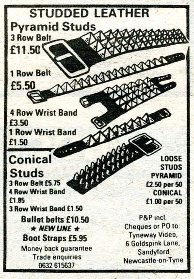
Studded leather advertisement from Tyneway Video, NME, 19th December 1981, page 83.


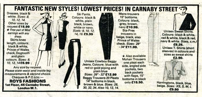
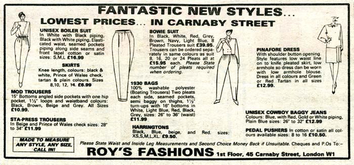
You might remember Roy's Fashions from the previous post, and his December 1981 ad doesn't disappoint:
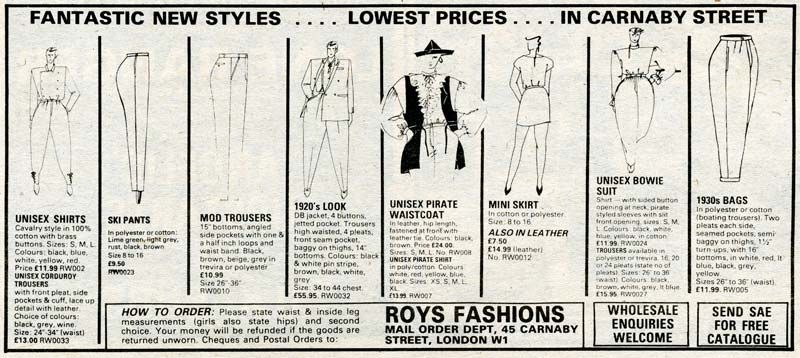
Roy's Fashions advertisement, NME, 19th December 1981, page 83.  Click on the picture for a larger view.

Roy's range has definitely gone more New Romantic, with a dashing unisex pirate waistcoat and matching pirate shirt, a balloon-legged unisex Bowie suit and what is billed as a "1920s look" suit, although from that sketch it couldn't look more 1980s to me.
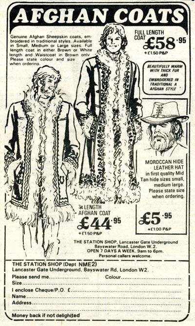

Afghan coats from The Station Shop, NME, 3rd January 1981, page 33.

Are those hippies still here?  Well clearly they are, and the Station Shop is still flogging these wretched Afghan coats to them.  Just stay out of the rain if you're wearing one - if you've ever smelt a wet Afghan coat you won't want to repeat the experience.

And now a scanner-stretching long ad from Melanddi, proud suppliers to the Jam, from December 1982:
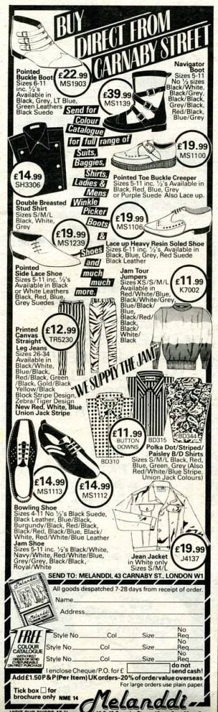
Melanddi advertisement, NME, 25th December 1982, page 75.

The printed canvas jeans remind me that I thought I'd find an ad for Modzart, who were the prime purveyors of printed canvas strides at the time - and I was sure their ads were regularly featured - but I didn't find one.

Moving swiftly on from that deeply uninteresting observation . . .
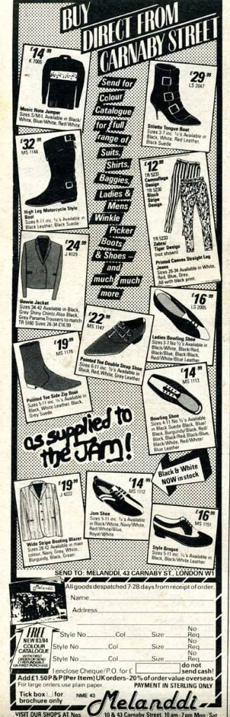

Melanddi advertisement, NME, 24th December 1983, page 75.

Here's Melanddi's Christmas 1983 ad, with a rather curious "Stiletto Tongue Boot" among its newer offerings. 
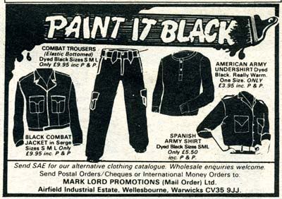

Mark Lord Promotions advertisement, NME, 24th December 1983, page 75.

Mark Lord Promotions have a novel line in black-dyed military surplus which I'm struggling to associate with any particular youth culture grouping of the time.  Its a bit too butch for the goths (hang on, when did New Model Army appear?), maybe a bit too austere for the punks . . . any help here would be much appreciated.
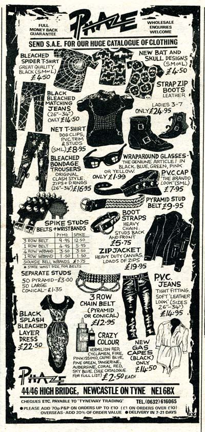

Phaze advertisement, NME, 24th December 1983, page 75.

Phaze of Newcastle has some proper cartoon goth gear, including some splendid bleached spider (web) jeans.  The note at the bottom that cheques should be made out to "Tyneway Trading" might suggest a link with the Tyneway Video studded leather ad earlier.
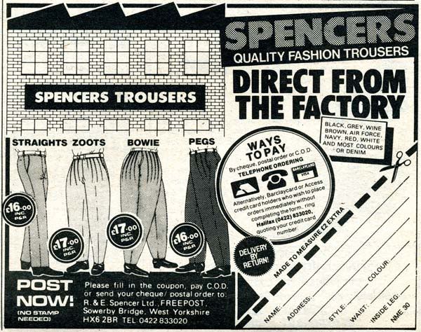

Spencers Trousers advertisement, NME, 24th December 1983, page 75.

I love the specialist suppliers' ads, and Spencers Trousers' one is a goodie.  In case you didn't believe they were "direct from the factory" there's a picture of it right there.  Despite the rather conventional graphic design, this ad inspires confidence in their trousers, and will you look at those Bowies - magnificent!
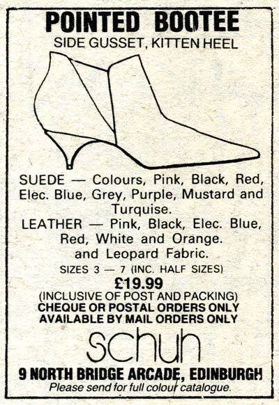

Schuh pointed bootee advertisement, NME, 24th December 1983, page 75.

A modest start for one of the familiar names on the British high street these days.  Schuh's pointed bootee is rather lovely, and comes in an extensive range of colours, plus leopard skin fabric.  I'm picturing Fay Fife of Edinburgh's finest, the Rezillos, in these. 

And here's another familiar shoe retailer, although possibly past its prime now:
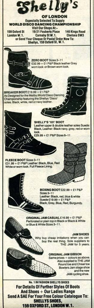
Shelly's of London shoe advertisement, NME, 24th December 1983, page 76.

I had no idea they supplied footwear to the World Disco Dancing Championship, which is quite some endorsement for the quality of their shoes.  The WDDC provided some golden tv moments in the late 70s and early 80s, and there's plenty of clips to enjoy on Youtube.  I've just spent far too long watching a few of them, but I failed to spot Shelly's breaker boot with the "disco" sole. 
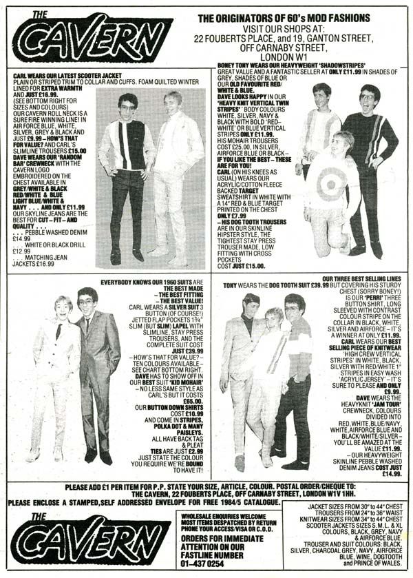

The Cavern advertisement, NME, 22/29th December 1984, page 75.  Click on picture for a larger view.

The Cavern is strictly mod, and I think its rather nice that they name their models.  So please meet Carl, Dave and "Boney" Tony.
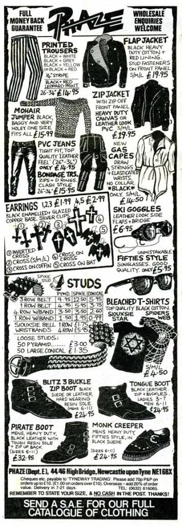

Phaze advertisement, NME, 23rd February 1985, page 37.

Phaze return in 1985 with their goth range, and a smattering of punk.

And finally, Mark Lord Promotions' 1985 ad (now trading as 'The Mark') has dropped the black dyed combat jackets and gone a bit New Wavey.  And the Bowie trousers endure:
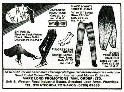
The Mark advertisement, NME, 23rd February 1985, page 37.

If anyone has any surviving items from these advertisers, or remembers wearing any of this stuff, your comments would be most welcome.

The only things that I recall having are the Sid-Vicious-on-tv t-shirt I mentioned in the previous post, plus a Boy punk shirt that was a copy of the Sex/Seditionaries ones with a woven patch of Karl Marx and a bleach written message "Only Anarchists are pretty."  This I bought from the Boy shop rather than mail order, and, incidentally, was filmed doing so by a Japanese breakfast tv show!


Oh yes, and some Shelly's extra-thick crepe soled brothel creepers.  Ah, memories . . .


Directory of advertisers

The Alien, 20 Corporation Street, Bolton, Lancs (skinhead coats)

Baxby Fashion House, 227 Portobello Road, London W11 (punk and mod)

Boy, 153 King's Road, London SW3 (punk)

The Cavern, 22 Fourberts Place, Carnaby Street, London W1; 19 Ganton Street, Carnaby Street, London W1 (mod)

Fab-Gear, 42 Call Lane, Leeds (also X Clothes shop premises) (punk/new wave)

Furs and Jeans, 48 Manor View, London N3 (Afghan coats)

The General Franchise Co. Limited
, 22 Park Grove, Edgware, Middlesex HA8 7SJ (Ted/rock'n'roll)

J. Holdsworth, 95 Lots Road, Chelsea, London SW10 (punk and mod)

P. Leach, 50d Redcliffe Gardens, Chelsea, London SW10 (punk)

Mainline, 51 Two Mile Hill Road, Kingswood, Bristol, BS15 1BS (punk)

Mark Lord Promotions
(mail order) Ltd, Airfield Industrial Estate, Wellesbourne, Warwickshire CV35 9JJ (black dyed army surplus)
By 1985 advertising as 'The Mark' at Unit 9, Western Road Industrial Estate, Stratford-upon-Avon, Warwickshire (new wave)

Melanddi, 43 Carnaby Street, London W1 (mod, new wave)

Phaze, 44/46 High Bridge, Newcastle-on-Tyne NE1 6BX (punk, goth)

Printout Promotions
, 28A Abington Square, Northampton (punk, mod, metal)

Punters Choice by Cadiss, 117 Hammersmith Road, London W14 (slim ties)

Radar
, 1st Floor, Virgin Records, Union Street, Glasgow and 3 Dundas Street, Edinburgh (retail stockist of P. Leach, punk)

Retro, 26 Union Street, Broadmead, Bristol 1 (mod leather)

Roy's Fashions, 1st Floor, 45 Carnaby Street, London W1 (new wave, mod, new romantic)

Schuh, 9 North Bridge Arcade, Edinburgh (new wave shoes)

Shapes, 252 High Street, Waltham Cross, Hertfordshire, EN8 N78 (hippy/ethnic)

Shelly's of London
, 159 Oxford Street, London W1; 19/21 Fouberts Place, Carnaby Street, London W1; 146 Kings Road, Chelsea SW3 (mod, punk, new wave shoes)

R & E Spencer Ltd, Sowerby Bridge, West Yorkshire, HX6 2BR (trousers)

The Station Shop, Lancaster Gate Underground, Bayswater Road, London W2 (Afghan coats)

Tyneway Video, 6 Goldspink Lane, Sandyford, Newcastle-on-Tyne (studded leather)

Sunday, 13 June 2010

NME fashions, 1980

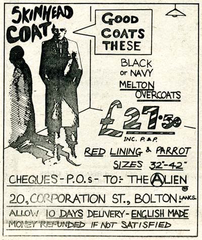
'The Alien' advertisement, NME, 20th December 1980, page 72. 

A brisk canter now through the NME clothing advertisements from my three surviving copies dating from 1980.  Starting with an authentically menacing hand-drawn ad for skinhead coats (presumably Crombie style) with a nicely no-nonsense tag line: "Good Coats These."


Fab-Gear advertisement, NME, 20th December 1980, page 72. Click image for a bigger view.

Fab-Gear of Leeds have the new wave angle covered, and their ad indicates that their retail outlet was X Clothes, an alternative clothing business that started in Manchester.  Music trivia fans will be delighted to learn that Johnny Marr worked in that Manchester branch just prior to forming the Smiths.


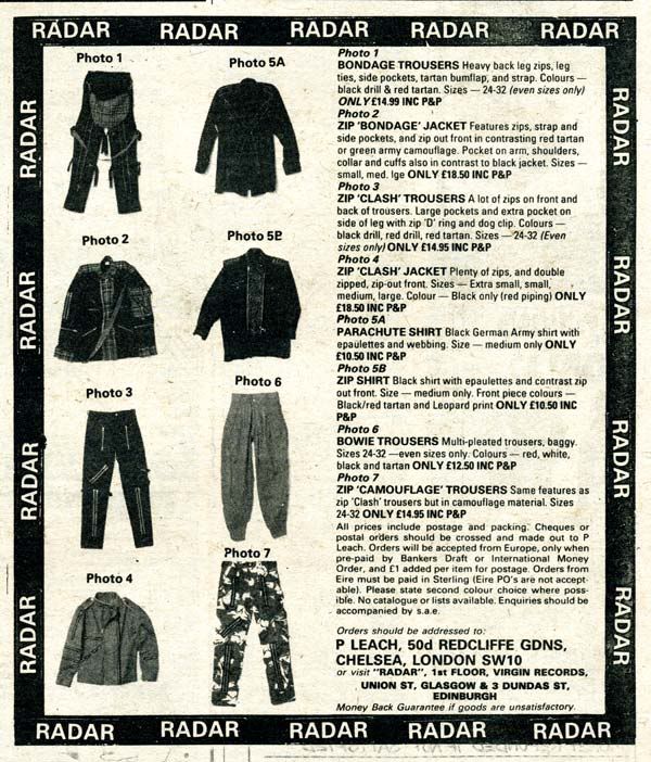
'Radar' advertisement, NME, 20th December 1980, page 73.  Click image for a bigger view.

Radar appears to be a Scottish retailer with shops in Glasgow and Edinburgh, but mail orders are referred to 'P. Leach' of Chelsea, which must be the same company as (possibly misprinted) 'B. Leach' whose bondage trouser ad from 1979 featured in the previous post.

You'll notice that multi-pleated 'Bowie Trousers' were a firm favourite around this time and several  advertisers (in this and the subsequent blog post coming soon) provide their own version of them. 


'Baxby Fashion House' advertisement, NME, 20th December 1980, page 72.  Click image for a bigger view.

Baxby's lamentable line drawings inspire little confidence, especially that Crombie in the bottom right corner.  Oh dear.

These days we routinely expect online retailers to provide full colour photographs from every angle, eye-popping zooms and even rotating 360º views, and it makes you realise what a considerable leap of faith it must have been to have sent off your cross-signed postal order based on a tiny, mis-shapen sketch that gives only the vaguest idea of what the garment might actually look like.


'J. Holdsworth' advertisement, NME, 29th March 1980, page 48.  Click image for a bigger view.

J. Holdsworth's drawings aren't much better, but at least there's a bit more detail. 


'Printout Promotions' advertisement for punk gear, NME, 29th March 1980, page 47.  Click image for a bigger view.

With some of these advertisers you get a sense that there might be some enthusiasm or at least interest in the culture they are exploiting catering for, but Printout Promotions isn't one of them.  They are just happy to produce whatever seems to be in demand.  And there's nothing wrong with that at all, in fact I admire their versatility.

So above, you'll see the punk range, and coming up below is the rock selection:


'Printout Promotions' Giant Rock Sew Ons advertisement, NME, 29th March 1980, page 48.  Click image for a bigger view.

Heavy Metal wasn't really the NME's turf (that was more Sounds territory) and this is the only specifically rock-related merchandise ad I found in my small and highly unrepresentative survey.

Mind you, I can't help warming to that slogan: "Rock on your Chest!"


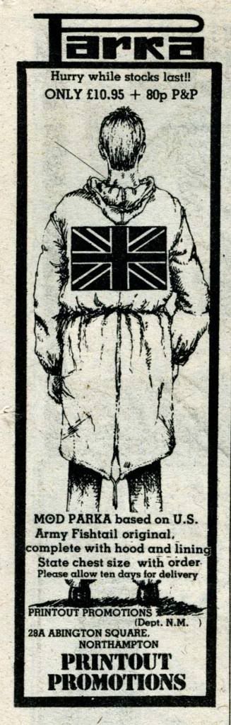
'Printout Promotions' parka advertisement, NME, 29th March 1980, page 48.  Click image for a bigger view.

And here Printout turns its hand to mod styles with Union Jack emblazoned parka.  In fact, I'm sure there were plenty of other subcultural fields that Printout Promotions trained their sights on.  An online search turned up a scanned copy of CB World magazine from April/May 1981 featuring a full page ad of theirs with the proud message: "Leaders in the field of personalised CB wear," which presents merchandise including everything from bodywarmers to car sunstrips.

From versatility to extreme specialisation, let's welcome the self-styled "most exciting Company in the Universe":


'Punters Choice by Cadiss' slim ties advertisement, NME, 27th September 1980, page 53.  Click image for a bigger view.

Punters Choice by Cadiss want to help those of you with overly wide ties, and their Asteroids tie certainly sounds tempting.  Interestingly, they accept Access credit cards - the only NME clothing advertiser I've found that does so - but without a telephone number it looks like those ties will remain "Hard To Find."


'Boy' mail order punk advertisement, NME, 27th September 1980, page 53.

Boy were one of the, er, big boys of punk clothing and I dearly wish I'd sent off for one of those full colour catalogues.

This ad has proved useful to me, though, by way of the mention of Kitsch 22.  I have an old sleeveless t-shirt with a picture of Sid Vicious on tv (printed sideways) that has a perversely black on black woven label.  After much squinting and angling to catch the light on this mystifying label I've discovered that it reads "Kitsch London" and probably came from Boy.

The t-shirt had been featured in a fashion magazine piece showcasing new t-shirt designs and I must have sent off for it, although I have no memory of doing so.  But I kept that clipped picture of the t-shirt (indeed it may still be around, somewhere . . .) and the garment remains in my wardrobe nearly 30 years later.

Steering back to the business in hand, the blog Planet Mondo has some pictures from the 1981 Boy Blackmail catalogue that are definitely worth a look.


'Roy's Fashions' advertisement, NME, 29th March 1980, page 48.  Click image for a bigger view.

I have a soft spot for Roy's ad, which has a lot to do with that black and white block panel mod dress.


'Roy's Fashions' advertisement, NME, 20th December 1980, page 73.  Click image for a bigger view.

And here's Roy in December 1980 offering not just Bowie trousers but a full Bowie suit for £39.95.


Finally, its heartening to see that the Teds, Britain's oldest and most venerable youth subculture, were not forgotten in 1980.  The General Franchise Company was there to dress them in Polyester Viscose Gaberdine:

'The General Franchise' Drapes and Drainpipes advertisement, NME, 29th March 1980, page 47.  Click image for a bigger view.

The next post will gather up the remaining NME clothing ads scanned from issues dating from 1981 to 1985, and I'll include a handy directory of all the advertisers just to keep up the nerd quotient.  Stay tuned . . .

Friday, 11 June 2010

What could you buy for £6.90 in 1979?

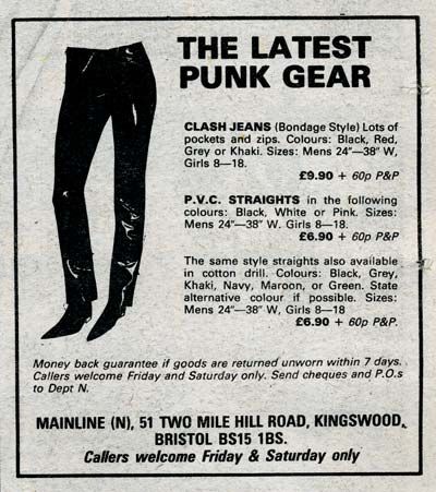
'Mainline' advertisement from the New Musical Express, 29th September 1979, page 63.  

You could treat yourself to some P.V.C. straights - in black, white or *gasp!* pink - as illustrated here in an advertisement by Mainline of Bristol.

I know punks were supposed to be skinny, but the smallest men's size offered here is an extraordinary 24" waist. This might suggest the target market included some very young punks indeed. 

On my recent browse through what little remains of my NME collection, I was drawn to the clothing ads that featured regularly in its back pages and seemed to cater for nearly every youth culture tribe active at the time.

Personally, I wouldn't have dreamed of ordering anything from them because I instinctively mistrusted those monochrome line art drawings and assumed that the garments would be shoddy and disappointing.  I'm sure this was most unfair in some cases, but when you're school-age and pocket money is tight, you tend to be ultra-cautious about where you spend your money. 

That said, I'd like to hope they would have provided a valuable service to provincial (and especially rural) teenagers, keen to express their tribal preferences in sartorial form, who lived more than a tube ride away from Camden Market or the King's Road. 

So, back in 1979, punks were pretty well catered for as you might expect:

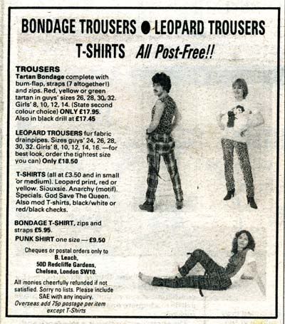
'B. Leach' advertisement, NME, 22nd December 1979, page 73.  

B. Leach of Chelsea offers tartan bondage trousers at £17.95 (bum flap and 7 straps included), and suggests that you order your fur fabric leopard drainpipes in "the tightest size you can."  Those models might have the requisite skinny figures, but they're just not trying hard enough with their hair.  Bondage-trouser-man looks like one of Harry Enfield's scousers, and the two women could be Nolan sisters.

However, it is still the 1970s and the hippies haven't yet been scared away by all those young punks in super tight trousers.

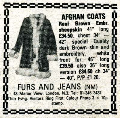
'Furs and Jeans' advertisement, NME, 22nd December 1979, page 73.  

It looks like its much more expensive to be a hippy than a punk.  £34.50 could get you nearly two pairs of B. Leach's bondage strides, or exactly five pairs of Mainline's P.V.C straights, not including p&p of course. 

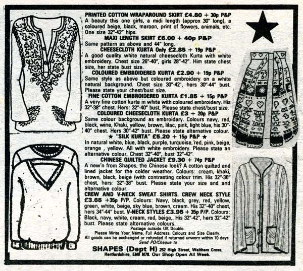
'Shapes' advertisement, NME, 29th September 1979, page 64.  

Maybe its not that expensive being a hippy after all, since Shapes of Waltham Cross, Hertfordshire, is providing printed cotton wraparound skirts for £4.80 and white cheesecloth Kurtas for £2.85. 

But if anyone's known for excessive spending on their wardrobe, its the mods.

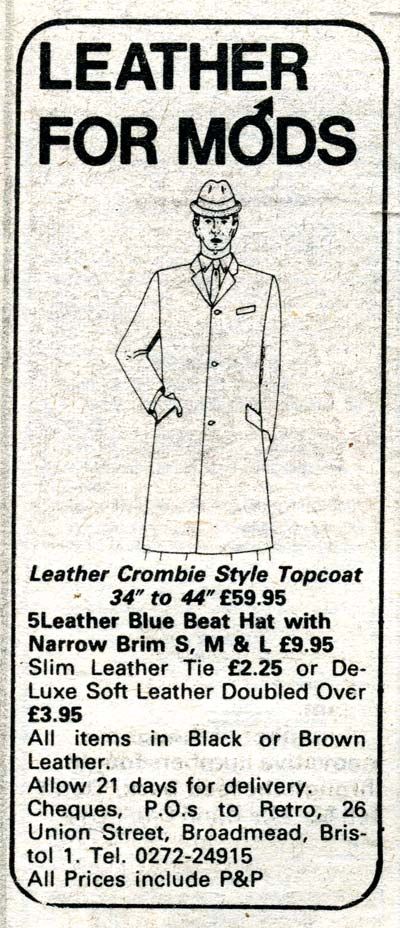
'Retro' advertisement, NME, 22nd December 1979, page 73.  

This leather "Crombie Style Topcoat," from Retro of Bristol, costs an impressive £59.95, and I'm sure I don't remember seeing any late-70s-mod-revival mods wearing one.  Leather ties, certainly, and possibly the odd leather "Blue Beat" hat, but the coat was probably not a big seller given that price. Plus, maybe I'm a bit conservative, but the idea of a Crombie in leather sounds pretty naff to me. 

That's about it from my two surviving copies of the NME from 1979.  There's plenty more ads coming as we plough on through into the 1980s and I'm determined to share them all! 

Authentic punk clothing - with the 'right' labels such as Seditionaries/Sex, Boy and so on - is now fetching big money from enthusiastic collectors.  I would argue that the other contemporary youth culture styles are interesting too, not least because very little of it seems to survive.

People grow out of their teenage enthusiasms and are often quick to bin those embarrassing reminders of their youth as they grow up, start thinking of their careers and/or their new young families, and decide that Pink Floyd were actually amazing despite what Johnny Rotten scrawled on his famous t-shirt.  

The mail-order retailers featured above weren't exactly authentic, but they provided cheaper copies for the majority of people who couldn't afford the originals.  I won't get into the arguments about whether this was piracy or not, or about quality issues - it was inevitable.

You might come across some of this old gear, and some of it might have labels sewn in (this isn't a given - many don't).  With my collector/vintage dealer head on, I reckon these ads might be a useful resource for finding out about those garments.

If you've still got something from one of these companies, or you remember ordering furry leopard print drainpipes from the NME, I'd genuinely love to hear about it.

Tuesday, 11 May 2010

Better Badges

I've been thinking about badges recently, and about how important they were to me in my early teenage years.

As a pupil at a school that required a uniform, badges were one of the few ways to broadcast your sophisticated taste and esoteric musical enthusiasms, and political/ethical concerns if you had any.  Of course, there were also the exuberantly biro'ed pencil cases and army surplus canvas bags but that's another story.

Crucially, they were also very cheap and made ideal pocket money purchases.

There were important distinctions in the style of badges dependent on your musical preferences.  I remember pop music badges in the 70s tended to be large and full colour - a photograph of a beaming David Essex as big as a coaster, for example.  Heavy metal fans favoured enamelled metal badges, or the later cheaper versions which were basically a metal square with a shiny plastic sticker, and the obligatory sew-on patches for their frayed denim waistcoats.

Punk and New Wave fans were more austere in their badge preferences (this was probably a result of limitations in budget and manufacturing capabilities as much as aesthetics).  Monochrome tended to be the rule, or maybe two colours at a push, and they were always small.  Bold graphic band logos tended to work best at this scale, PiL's being a particularly successful example which worked at every size from button badge to shoulder-spanning back-of-the-leather-jacket artwork. 

I filled up my school blazer lapels from a small record retailer in Lincoln called Sanctuary records, which had a black felt-covered board covered in tiny, ¾" badges from which I made my careful selections.

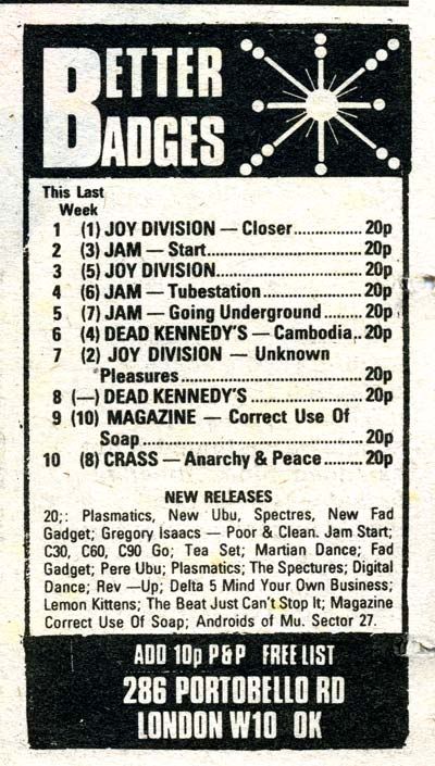
Around the same time, I began reading the NME which had a regular advertiser - Better Badges.  They placed their tiny box ad on the inside last page, always in the bottom right corner.  Happily, I've just found the remains of my NME collection (now reduced to about a dozen copies in total) dating from 1979 to 1985.  And the early ones do indeed have Better Badges ads.

Better Badges ad, NME 27th September 1980.

As you can see, they presented their top sellers in a weekly chart and it gives a wonderfully concise snapshot of the popular underground (if that's not a clumsy oxymoron) music scene of the time.  Apart from the Jam, who weren't underground at all really (despite that song title, yes I see it!)

I can imagine little teen mods satisfying their fan worship by stocking up on badges whilst they save up to buy some black and white bowling shoes, just like Paul Weller's.

Schoolkids usually don't have much money to spend.  You might buy a badge of a record before you bought the record itself.  Or you might buy the badge instead of the record, and satisfy yourself with a fuzzy tape recording of the track off John Peel.  At least you knew about it, and you could let everyone else know you knew about it too.

Better Badges was great because it was right on the money, producing little mascots of nerdy fandom exactly when you needed them.  Before 'everyone else' had heard of them.


Better Badges, NME 3rd January 1981.  

This ad from January 1981 indicates a rising political awareness with the CND badge (Campaign for Nuclear Disarmament) topping the chart.  I'm sure it was around this time that I sent off for my copy of the CND booklet Protest and Survive, which scared me witless.

I honestly can't remember if I ordered badges directly from Better Badges.  Being isolated in a village in rural Lincolnshire, I regularly sent off postal orders for records and fanzines, and then raced to beat the dog to the post before she tore the packages to shreds (I still have a few records with teeth marks).  The company was also an important producer and distributor of fanzines and its very likely that some of my postal orders went to them, but I'm hazy on this.  At any rate, its certain that I wore their badges.


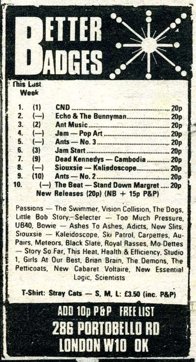
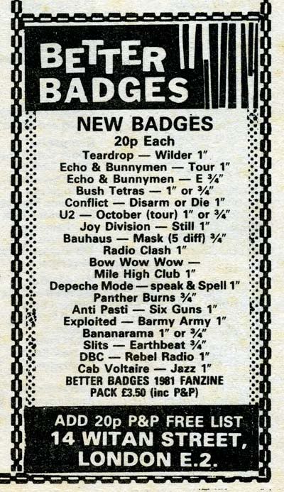
Better Badges ad, NME 19th December 1981.

By December 1981, Better Badges had dropped the chart and just listed their new productions, and the P&P had doubled to 20p.

The next year - 1982 - I left school and went to art college, and I think my badge-wearing years ended at around the same time.  Perhaps I considered them a little gauche and immature now I was a grown-up student (oh dear).  It looks like Better Badges stopped advertising in the NME shortly after this too, since my few later copies don't have their ads.

This enjoyable trawl through old NMEs has lead to a day-long scanning session because I was drawn to the clothing ads in the back pages.  So my next few posts will explore the delights of the mail order clothing companies that sold through my (then) favourite music weekly.  


Further reading

I've been very slack about doing research for this post, in fact I haven't done any in my rush to post something after quite a lull.

If you would like to learn more about Better Badges, check these links:

A short history of Better Badges and its role in badge and fanzine production and distribution.

An article by Joly MacFie, founder of Better Badges, which explores how the emergence of cheaper reproduction technologies enabled the DIY/anyone-can-do-it ethos of punk. 

A Village Voice article about Joly MacFie and punkcast.com.

Friday, 19 February 2010

You deserve a Whitbread!

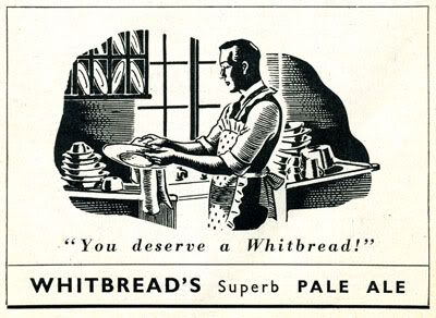
Whitbread Pale Ale advertisement in Lilliput, June 1947, page xv.

This startling advertisement appeared in Lilliput magazine's June 1947 issue. A man is pictured in a frilly apron doing the washing up, presented with no comment or indication that this is the least bit remarkable.

Taken in the context of the immediate post-war years, it did surprise me. Men were returning from fighting six long years of war and the usual story we are told is that women who had ably coped with 'men's' jobs - working in munitions and aeroplane factories during the war - were immediately pushed out of their jobs and ordered back into the home and kitchen where they belonged. It was back to 'business as usual' - the reassuring gendered division of labour with women as housekeepers and mothers, men as breadwinners, and pampered kings of the castle at home.

This ad complicates those assumptions. There's no suggestion that this man is emasculated by helping out at home, even with a frilly apron on, and the scenario is not exploited for comic effect (as it inevitably would be today). In fact he looks rather noble in his woodcut-style vignette. Perhaps gender roles in the post-war years were a little more complicated and nuanced than we have been led to believe by most popular histories.

Of course, I'm sure most women wouldn't have expected to be rewarded with a bottle of pale ale for doing household chores, so there's an indication that the man's efforts are a little bit special, although obviously not unusual.

In fact, within a few pages of the same magazine is another very similar advertisement:

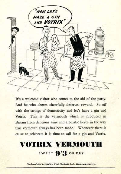
Votrix Vermouth advertisement in Lilliput, June 1947, page iii.

The occasion this time is the aftermath of a party, with two gentlemen gamely tackling the piles of dishes. They both wear feminine, patterned aprons and are again deserving of a reward in the form of an alcoholic drink. A delighted-looking wife peers through the door (and then perhaps runs off to fetch their drinks?!)

Did men do anything else around the home except the dishes, now and then? Perhaps . . .

Vactric vacuum cleaner advertisement, from Housewife, November 1947, inside back cover.

This vacuum cleaner advertisement from the same year is rather less credible ("Give him a Vactric"? Hmm) and there is a lightly ironic tone to the copy: "When the household god descends to lend a hand" is a clear indication of the 'normal' domestic power relationship, however humorously expressed.

So the idea of a man helping out with onerous domestic chores is framed in all these advertisements as a sort of special treat for their wives, who are still expected to do them most of the time. But at least its not portrayed as ridiculous or unmanly, as you might expect even to this day, and its considered unremarkable enough to be featured in mainstream advertising.

It makes me wonder how far we've progressed since then (as I contemplate the stairs that need vacuuming . . .)

Sunday, 24 January 2010

Endorsed by Madame Schiaparelli

The fashion designer Elsa Schiaparelli presents an interesting contrast to Gabrielle 'Coco' Chanel - they were reportedly bitter rivals during the 1930s when Schiaparelli was in her prime.

Chanel, a determined social climber, was desperate to shake off the stigma of her poverty-stricken origins, whereas Schiaparelli was born into privilege as the daughter of aristocratic parents.

Chanel introduced a luxurious simplicity and practicality into high fashion, and was skilled with a needle, having trained and worked as a seamstress in her early years, whereas Schiaparelli had no formal fashion or dressmaking training but was gifted with a talent for adventurous innovation, stimulated and enhanced by her close personal association and collaboration with some of the leading avant-garde artists of her day.

There's plenty of information online (and in good, old-fashioned books!) about the careers of both designers, so there's no need to repeat it here. What interests me right now is some print evidence of Schiaparelli's commercial collaborations with two manufacturers, which perhaps present another interesting contrast with Chanel. I would have to do much more detailed research to discover if Schiap (her nickname - pronounced 'Skap') was unusual in this respect - its too late to venture to the library right now, and I'm keen to post this sooner rather than later so please forgive the lack of comparative evidence from other designers.

This 1936 advertisement for Lightning Coloured Plastic Zipp Fasteners below (manufactured by Imperial Chemical Industries - the still mighty ICI) proudly displays a brown wool dress designed by Schiaparelli with a very prominent zip running down the centre front. Dilys E. Blum, in her book Shocking: The Art and Fashion of Elsa Schiaparelli, notes that Harry Houghton, of the Canadian division of the Lightning Fastener Company had offered Schiaparelli £10,000 to use their recently developed coloured plastic zips in her clothing in 1933.

She obviously needed no further encouragement. According to most sources, Schiaparelli was the first Parisian couturier to utilise zip fasteners - indeed, to make a prominent design feature of them rather than hide them away as most functional clothing fasteners were by convention. (Apart from buttons, of course, which have been a handy way to display wealth and taste for some time).

Anyway, back to the advertisement. This conspicuous zip adds a considerable sexual charge to what is ostensibly a rather modest garment. Remember, zips are very easy and quick to open, and this dress flaunts its ability to be opened from top to bottom in seconds flat.

The juxtoposition of the model with a classical Greek-looking nude sculpture serves to underline this subliminal message, while at the same time adding a shrewdly judged gloss of 'culture' and prestige. This ad, although it doesn't look like it at first glance, was a pretty challenging and provocative proposition for the mid 1930s:

Lightning Zipp advertisement from (British) Vogue, 14th October 1936, page 19.

In her autobiography, which alternates disconcertingly between the first and third person, Schiap makes no mention of her lucrative promotional deal with Lightning Zipps but does describe the impact her use of zips made when first presented in a collection of hers. This was actually the August launch of her Winter 1935-36 collection, although this is not stated in the text:
. . . what upset the poor, breathless reporters most were the zips. Not only did they appear for the first time but in the most unexpected places, even on evening clothes. The whole collection was full of them. Astounded buyers bought and bought. They had come prepared for every kind of strange button. Indeed these had been the signature of the house. But they were not prepared for zips. They grasped the significance of the new trend even more than Schiap, and they bought and bought . . .
She must have been delighted with the overflowing order books, but then found herself facing an unanticipated problem:
On delivery day, however, our telephone started to ring viciously, and the desperate voices of all the commissionaires were raised to a pitch of indignation.
"The dresses cannot be shipped."
For some peculiar reason, still unknown to me, there was some agreement or contract between France and America whereby zippers could not be imported. Cables and radio-telephone calls were exchanged across the Atlantic and the zipper controversy reached the size of a political issue. After a few days of hair-tearing and supreme exhaustion, the zipper dresses were at last allowed into America, and ever since, like Columbus, they have remained unchallenged.
Blum records that on July 18th 1936, "The U.S. duty on imported zippers increase[d] from 45 per cent to 66 per cent, threatening to delay the export of Schiaparelli's collection."

Perhaps it was this difficulty that led Schiap, as the V&A explains, to use different zip companies depending on where her garments were to be sold: "In London she used zips from the Lightening Fastener Company of Great Britain, in Paris she used zips made by Éclair and for export to the USA, Hookless Fastener Company zips produced in the USA."

By the following year, the Lightning Zipp campaign featured more conventional illustrations of Schiaparelli's designs in a fashion show setting:

Lightning Zipp advertisement from (British) Vogue, 14th April 1937, p.65.

The copy reads:
Zipps on day suits, on evening gowns, on cocktail trouser suits. Zipps at front, side or back, in every colour of the rainbow, matching, contrasting . . . always decorative, always practical. Schiaparelli has made plastic zipps a feature of her recent collections, and continues - as do other leading couturiers - to use them for fashion fastening.
By August 1937, a subsequent Lightning Zipp ad makes no mention of Schiaparelli so perhaps that deal had run its course. However, Schiap had plenty of other irons in the fire.

As early as 1929, Schiaparelli had licensed her designs for reproduction by ready-to-wear companies and paper pattern manufacturers in America. Her fascination with textiles, and especially new developments in synthetic fibres, led her to collaborate with a number of manufacturers including Bianchini, Colcombet and Ducharne. She could see interesting textural potential even in test fabrics dismissed as 'mistakes' by their producers and was responsible for popularising a number of innovative new materials, including rayon crêpes.

During the early 1930s she endorsed a number of American-produced fabrics, not to mention hosiery and shoes, seeing these collaborations as a valuable way to develop and enhance her profile in that vast and lucrative market. But she also had strong connections with Great Britain - she regarded the country as her second home - and loved British textiles such as Scottish tweeds.

In November 1936, the British textile manufacturer William Hollins & Co. launched its new range of thirty-six 'Schiaparelli Viyella Fashion Fabrics' made of a blend of cotton and wool. She was credited with making this rather prosaic and workaday fabric fashionable, and in this following sequence of advertisements it is clear that she had some fun with this commission:

Viyella/Schiaparelli advertisement from (British) Vogue, 22nd April 1937, pp.58-59.

In this ad from April 1937, the layout makes a playful reference to pageantry, with heraldic motifs such as the shield, the crown and the ribbon. And the copy makes this explicit:
Schiaparelli herself has styled the new 'Viyella' Fashion Fabrics for this smartest, most colourful, most romantic of seasons. Bright challenging colours and subtle elusive shades. Novelty weaves. Checks, spots, stripes, and designs of entirely new character. A special heavier weight 'Viyella' for tailored suits and dresses.
A pageant of fabrics for a season of pageantry.
The Schiaparelli model photographed opposite is one of many 'Viyella' models in her latest collection, and she is featuring the new 'Viyella' Fashion Fabrics in her Paris Sportshop. These very same fabrics are now in all the shops for you to choose from . . . for that extra frock, that extra suit for this exciting season.
This was a coronation year (not Edward, ahem - he preferred a gilded and comfortable exile with his American divorcée - but his quiet brother George) so that explains all the pageantry.

Incidentally, a pasted-over addendum reluctantly adds the news of a price increase for these fabrics, from 4/11 to 5/11 per yard (in today's money, from £11.82 to £14.22, thanks Measuring Worth!)

The mannequin's curiously pointed knit hat makes her look like a chess piece, which is a happy coincidence when we consider the next advertisement, from November 1937:

Viyella/Schiaparelli advertisement in (British) Vogue, 10th November 1937, pp.18-19.

In this case, the theme isn't exactly chess, but Alice in Wonderland:
When I said "Check!" you purred!" said Alice (Through the Looking-glass) to her kitten - and when you see the new Schiaparelli-designed 'Viyellas' you'll react much like the kitten. Here are checks indeed! Unexpected, out-of-the-ordinary checks, the kind that make glorious little tops of two-pieces, spruce tailored frocks, swagger 'cow-boy' shirts, and so on. Crowds of other patterns too, embroidered spots and tricky little stripes - all in original, becoming fashionable colour schemes. The lovely blending plains are also important - Schiaparelli has used two of them for her superbly moulded jacket-blouse and skirt photographed here - Bright Rust (No. 8358) over Good Earth Brown (No. 6843). Both 'Viyella' Thirty-Sixes. Both in the shops now!
I have a fondness for old-fashioned advertising spiel, so forgive me for drafting all this text. Its wonderful!

The next ad, from September 1938, startled me because it looks as if it dates from nearly twenty years later:

Viyella/Schiaparelli advertisement in (British) Vogue, 7th September 1938, p.9.

I'd love to know if these fabrics were indeed "Unshrinkable. Fadeless" as the copy proudly declares. Are there any Schiaparelli collectors out there with examples of her late 30s sportswear who can verify this claim?

This last ad, from November 1938, looks more of its time, featuring a three-quarter length swagger coat and a wonderful 'up' hairdo of a kind that would remain in favour throughout the 1940s:

Viyella/Schiaparelli advertisement in (British) Vogue, 2nd November 1938, p.20.

Plus it has scotty dogs, which is always a good thing in my book.

Schiaparelli was obviously a very shrewd businesswoman, as well as an inspired designer, who had no snobbishly bourgeois scruples about entering into business deals with those who might be considered a little too populist - a little too 'mass market' - for an elite Parisian couturier to associate his or her name with.

As I've stated earlier, I really do have no idea to what extent other contemporary couturiers - such as Chanel - dipped their toes into that mass market (and I'm aware of her perfumes - this is a different degree of diffusion), but I will explain that I gathered these advertisements while scouring through the Gallery of Costume's bound collection of British Vogues. I noticed that no other couturier featured in ads of this kind during the 1930s. Perhaps if I had leafed through the American Vogues, I might have discovered a different story . . .

The two couture giants faced very different fates after the Second World War. Schiaparelli found herself out of step with fashion and finally closed her business in 1954 - the same year that Chanel emerged from her exile in Switzerland to relaunch her salon to widespread international acclaim (I understand that it wasn't the French who were cheering - they remembered her cosy intimacy with the Nazis too well).

As a result Chanel secured her place among the fashion immortals and her house endures, its status revived and maintained by Karl Lagerfeld. Schiap is hardly forgotten, but she gradually recedes back in time as a respected and revered figure too closely associated with her prime years in the 1930s to be considered relevant today.

And to finish, a charming short promotional film for cotton knitting yarns from the mid 1930s, which might not seem to have anything to do with Schiaparelli. You'll just have to watch it to the very end to understand why it is here:

PARIS MODES - (AKA COATS COTTON FILM)


Additional notes

Information was gathered from two books which I would recommend as essential if you have any interest in Schiaparelli -

Elsa Schiaparelli (recently republished by the V&A) Shocking Life: The Autobiography of Elsa Schiaparelli.

Dilys E. Blum, Shocking: The Art and Fashion of Elsa Schiaparelli.

Tuesday, 1 December 2009

Slap Up Tog

A Victorian handbill found in a book by Renée Huggett called Shops published in 1969.

This marvellous Victorian promotional handbill (flyer) from London addresses the discerning working man in need of new clothing. Written in a presumably authentic slang current at the time, it has an immediacy and humour that defies its age, even though much of it is completely mystifying to the modern reader.
Let's have a go:

Mr H nabs the chance of putting his customers awake, that he has just made his escape from India, not forgetting to clap his mawleys upon some of the right sort of stuff, when on his return home he was stunned to find one of the top Manufacturers of Manchester had cut his lucky, and stepped off to the Swan Stream, leaving behind him a valuable stock of Moleskins, Cords, Velveteens, Box Cloths, Plushes, Doe Skins, Pilots &c., and having some ready in his kick--grabbed the chance--stepped home with the swag--and is now safely landed at his crib. He can turn out Toggery, very slap at the following low prices for

Ready Gilt--Tick being No go.

Upper Benjamins, built on a downy plan, a monarch to half-a-finnuff, Fishing or Shooting Togs, cut slap, 1 pound, 1 quarter, and a peg. A Fancy Sleeve Blue Plush or Pilot ditto, made very saucy, a couter. Pair of Kerseymere or Doeskin Kicksies, built very slap with the artful dodge, a canary. Pair of Bath or Worsted Cords, cut to drop down on the trotters, a quid. Pair of out and out Cords, built very serious, 9 bob and a kick. Pair of stout Broad Cords, built in the Melton Mowbray style, half a sov. Pair of Moleskins, built hanky spanky, with a double fakement down the sides and artful buttons at bottom, half a monarch.

MUD PIPES, KNEE CAPS, AND TROTTER CASES BUILT VERY LOW.

A decent allowance made to Seedy Swells, Tea Kettle Purgers, Head Robbers, and Flunkeys out of Collar
Gentlemen finding their own Broady can be accommodated.

(My thanks to flickr contact Bollops for taking the trouble to transcribe this text when I originally posted this picture there).

Many of the terms are obviously types of cloth: moleskin (a heavy, cotton cloth with a short, soft pile on one side), corduroy, velveteen, box cloth (I failed to find a definition of this), plush, doeskin (a fine, soft woollen cloth), pilot (a thick woollen cloth, often dyed blue used for overcoats and sailors' gear), kerseymere (a twilled fine woollen cloth).

Then there's prices: a monarch (a sovereign? That's one pound), half-a-finnuff (? - thanks to alan.98's comment below, I've discovered that a finnuff is Yiddish for a fiver), 1 pound, 1 quarter (a crown or five shillings? One pound was twenty shillings) and a peg (?), a couter (a sovereign, found in an excellent article on costermongers' backslang on the Victorian Web here), a canary (?), 9 bob (9 shillings) and a kick (?)

And of course, there's the garments on offer themselves: many appear to be trousers, such as the kicksies, or the cords "cut to drop down on the trotters (feet?)." Perhaps the "Upper Benjamins" and the "Fancy sleeve Blue Plush or Pilot ditto" are coats or jackets - the mention of a sleeve is a bit of a clue! "Mud pipes" might be some kind of oilskin waders or trousers, but I'm guessing here. "Knee caps" are possibly protective pads worn over the knees for labourers who have to kneel in their work, but again this is pure speculation. "Trotter cases" are likely to be boots if we can assume that trotters are feet.

The final call to "Seedy Swells, Tea Kettle Purgers, Head Robbers, and Flunkeys out of Collar" strongly suggests that Mr Harris is happy to do business with men of dubious reputation, so long as they have the ready cash of course.

This is a piece densely packed with detail and description, and deserves much more research than my desultory efforts.

But as much as its fun to try to translate this text, perhaps the most enjoyable thing about it is the way it reads. I would love to hear Bob Hoskins tackle this in his ripest Cockney growl.

Apparently Mr Harris advertised widely, or he copied a widely used format. More or less the same text, with some minor variations, appears in Mayhew's London Life and the London Poor of the mid 19th century (scroll down to the last quarter of the page or do a search for "slap up" on that page to find the passage), and in the New York Herald in 1888, which suggests that this tailor/outfitter was so familiar with the London criminal underworld that his handbill "appeals to the thieves, burglars and outcasts from society only."

This assertion is unfair I believe. Mr Harris was clearly drawing from the rich source of contemporary slang that would have been readily understood by its intended audience - working class men living in the slums of London. That's not to deny that perhaps Mr Harris was borrowing a bit of underworld cool by using terms that were not entirely respectable or correct, especially in Victorian times, but he was clearly a shrewd businessman who knew how to speak to his market. And he was aware that a more formal approach was a waste of time and expense (handbills cost money to print).

Credits are due. My sincere thanks to flickr friends Bollops and Art Nahpro for doing all the heavy leg-work to unearth most of the links that I have used in this piece.

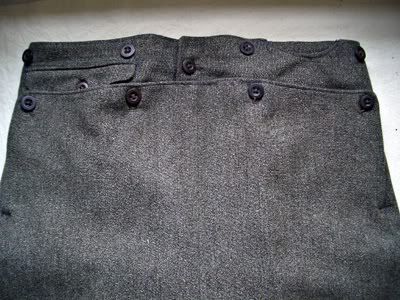
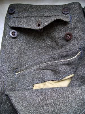
I've not finished yet! At that time (19th century), trousers would not have had the central vertical fly front we are familiar with today, but a fall front. This is a method of fastening the trousers with a flap that spanned the front waist and was fastened with buttons. Take a look at this pair of trousers which will give you the idea:


These trousers are from a suit made possibly in the early 1930s, according to the museum record, which is in the collection of the Gallery of Costume, Manchester. You can see that there are four buttons near the waistband which open to reveal:

OK, that might not be what you were expecting. This is under that front panel you saw above, and there's the pocket with a flap at the top which was visible in the first picture, and also a hidden diagonal welted pocket below it.

Sorry, this is getting complicated! So if you were getting dressed you would have to fasten two side panels of the trousers with a central button or two, and then fasten up the four buttons that secure the fall front over that.

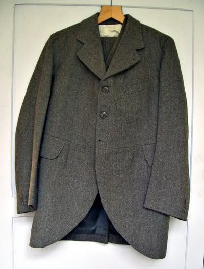
I'm pretty sure this style was archaic by the time this suit was made, and it doesn't look like a regular "lounge suit" as it is catalogued in the museum. To be fair, I'm sure there was a note in the museum record about it being a gamekeeper's suit, which would make much more sense. This suit is very old-fashioned for the time, assuming that given date is correct, and is sturdy and warm enough for tramping through the Cheshire countryside in the depths of winter with a shotgun over your shoulder and maybe a brace of pheasants hanging off your belt.

Just to complete the picture, here's the jacket of the suit:


Its beautifully curved cutaway hem, high button front fastening and waist seam speak of earlier days. The days of Mr Harris even.

There's been a dearth of film in recent posts, so this is the nearest I can get to Mr Harris's time and place - a wonderful film from 1903 of Petticoat Lane, London, from the BFI's Youtube channel. Don't you wish it had a soundtrack?:

Saturday, 21 November 2009

What could you buy for one shilling in 1928?


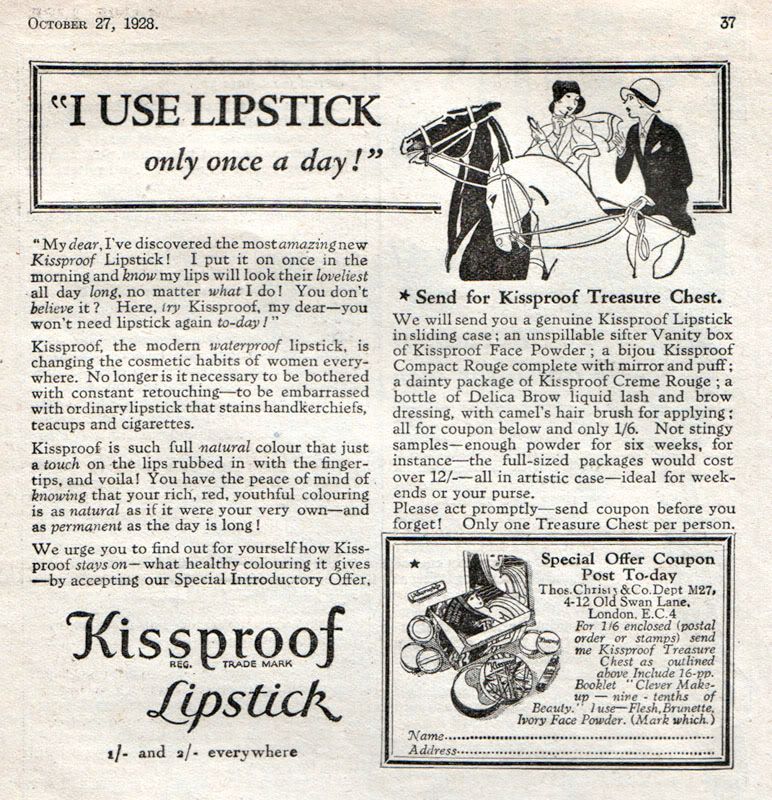
Kissproof lipstick advertisement from Woman's Life magazine, October 27th 1928.


You could buy a Kissproof lipstick in a "rich, red, youthful colouring" that is not only waterproof but requires only one application in the morning because it is "as permanent as the day is long."

Now that is quite some claim to make, because I'm sure that right at this moment there are boffins in the labs of L'Oreal still busily trying to formulate a lasting lip colour to live up to that kind of claim. Perhaps the Kissproof formula included a pigment that actually stained the lips?

According to Wikipedia that was indeed the case: "long-lasting, indelible stains were the most popular" in the 1920s.

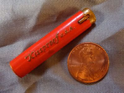
So if this lipstick (lip dye?) required only one application a day, presumably you wouldn't need much of it. In fact, the lipsticks were tiny:

Kissproof lipstick, with a cent for scale (apologies to UK viewers, the cent appears to be the universal indicator of scale - it is slightly smaller than a penny).

This example measures just under 1¾ inches (4.2 cm) long and just over ¼ inch (9 mm) wide. I can't remember how I acquired this lipstick, but I suspect it was from the days when my mother ran a vintage clothes shop and would sometimes find things (shopping lists, hair grips, handkerchiefs, no diamond rings unfortunately) in the old handbags she sold.

Its not cylindrical as you might expect, but a kind of flattened, oval shape, and it has been used right up to the nub (it was a matte, dark red colour, incidentally).

Another popular lipstick brand was Tattoo:

This has the typical cylindrical shape, but is only 1 inch (2.5 cm) in length. It is etched with dancing maidens dressed only in skimpy grass skirts.

Compared to modern lipsticks, these are absolutely tiny, and must have been a boon in the days when handbags were correspondingly petite.

Just to return to the Kissproof ad at the top for a moment: it strikes me as a rather strange advertisement for a cosmetic product. Its very brisk and English, with two posh, outdoorsy women ("My dear") conversing on horseback. This is not the kind of scenario you might associate with a lipstick - I'd imagine a night club, or fancy restaurant, or one of those newfangled cocktail bars that came over from America during the 1920s. Where's the glamour, or the sex appeal?

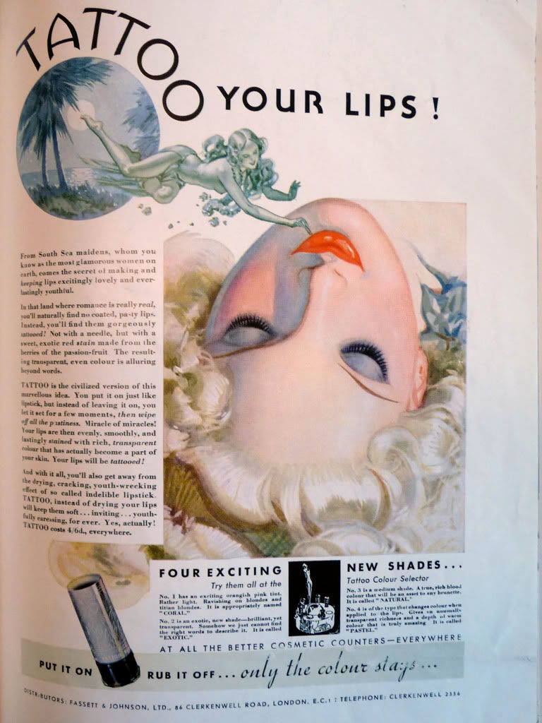
Well, the Tattoo lipstick company knew all about sex appeal, and in a series of advertisements from the 1930s they laid on the glamour and exotic sex appeal with a trowel:


Vogue, 7th August 1935, full page ad on the back cover.

"From South Sea maidens, whom you know as the most glamorous women on earth, comes the secret of making and keeping lips excitingly lovely and everlastingly youthful.

In that land where romance is really real, you'll naturally find no coated, pasty lips. Instead, you'll find them gorgeously tattooed! Not with a needle, but with a sweet, exotic red stain made from the berries of the passion-fruit. The resulting transparent, even colour is alluring beyond words."

Now that's more like it! "Really real" romance! And there's even a glimpse of bosom!

The recumbent female figure with the dewy lips was a signature feature of many of these Tattoo ads:


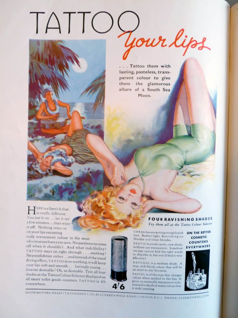
Vogue, 21st August 1935, full page ad inside the back cover.

Here, a modern, swimsuit-clad young lady precisely echoes the posture of her South Sea island sister, who is so transported by the dreamy guitar melodies that she's writhing on the ground!

"TATTOO is so soothing, it will keep your lips soft and smooth . . . lastingly young . . . forever desirable! Oh, so desirable."

Phew! I think we're getting the message. I'll bet these overheated, sensual ads found a receptive audience beyond their intended market.

Incidentally, they've also dropped the claim that these lipsticks are made "from the berries of the passion-fruit" which I'm sure was completely untrue, not to mention faintly ridiculous, and was probably only added because it had the word 'passion' in it. EDIT: I've re-read the copy and its clear I misunderstood it - those South Sea maidens were supposedly 'tattooing' their lips with passion-fruit - it was not claimed to be an ingredient of the lipstick. I'm not convinced that you would get much colour from a passion-fruit so the idea is still preposterous!


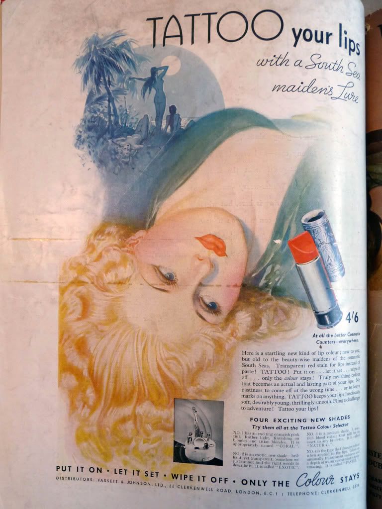
Vogue, 4th March 1936, full page ad on the back cover.


They must have liked that swooning posture, because you can see one of the women at the top of this ad in more or less the same position, not to mention being naked and with two other naked women.

"Fling a challenge to adventure! Tattoo yours lips!"

And what kind of adventure might that be, hmmm?


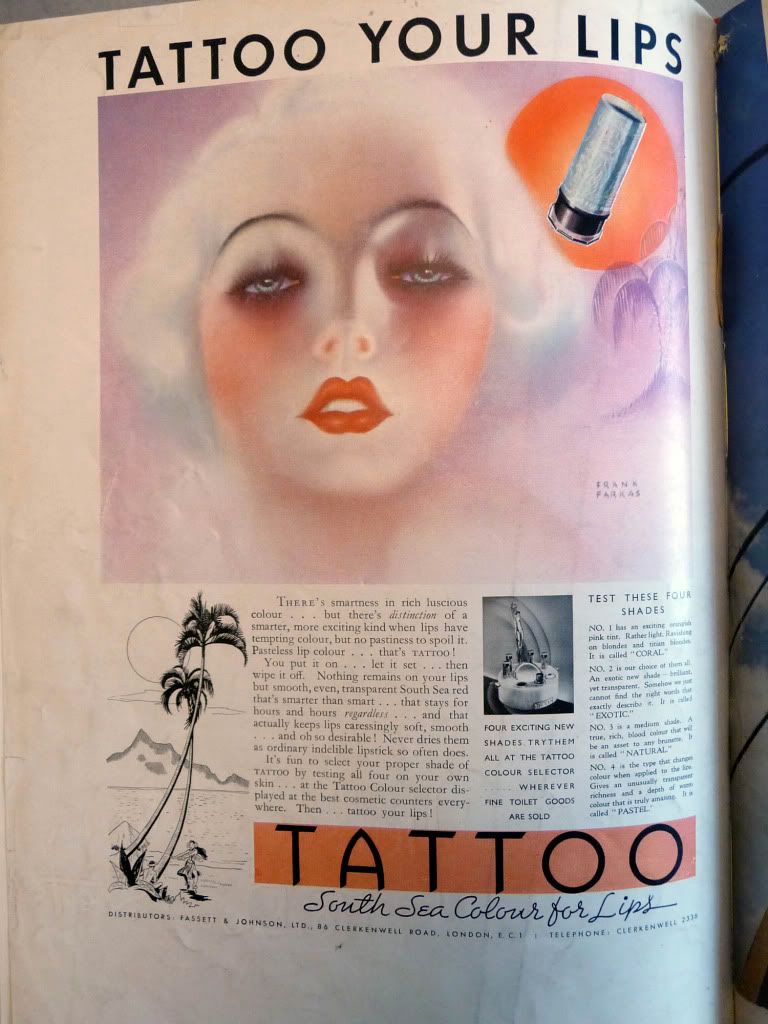
Vogue, 15th April 1936, full page ad on the back cover.

South Sea exoticism is relegated to the bottom left corner in this 1936 ad, which features an ethereal Jean Harlow type, the right way up for a change. (This illustration is signed by Frank Farkas, about whom I've failed to find out much except that he trained in Europe and worked in an ad agency called Farkas-Jensen-Farkas in Chicago).


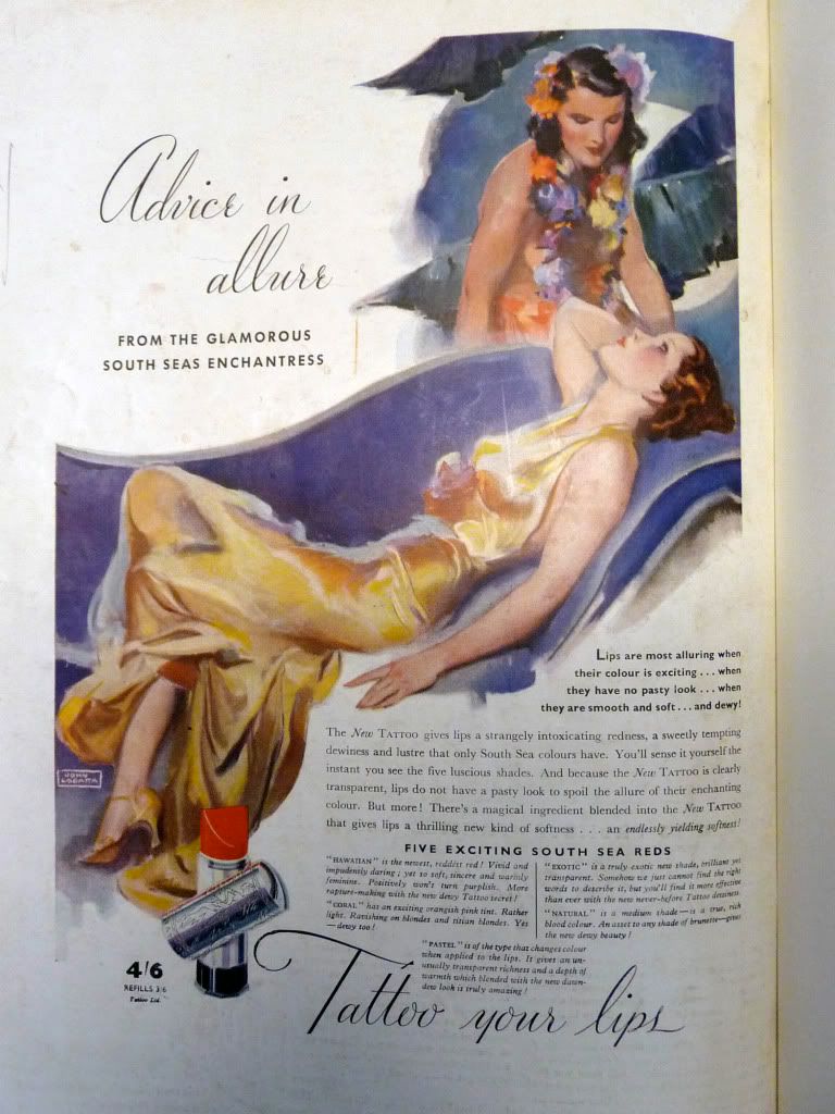
Vogue, 7th July 1937, full page ad on the back cover.

This last Tattoo ad, illustrated by John LaGatta has a "South Seas Enchantress" whispering secrets to a languid chestnut brunette in a gloriously liquid satin gown. Its perhaps a little more restrained (if you ignore the hint of lesbian eroticism, that is), although the copy is anything but:

"There's a magical ingredient blended into the New TATTOO that gives lips a thrilling new kind of softness . . . an endlessly yielding softness!"

Well, really. I can feel my inner brisk Englishwoman losing patience now. That's quite enough of that!

[Note: the Tattoo advertisements were found in bound copies of British Vogue, held at the Gallery of Costume, Manchester].